import pandas as pd
import matplotlib.pyplot as plt
from collections import Counter

# set this so the graphs open internally
%matplotlib inline03_Visualization -> Chipotle
This time we are going to pull data directly from the internet. Special thanks to: https://github.com/justmarkham for sharing the dataset and materials.
Step 1. Import the necessary libraries
Step 2. Import the dataset from this address.
Step 3. Assign it to a variable called chipo.
url = 'https://raw.githubusercontent.com/justmarkham/DAT8/master/data/chipotle.tsv'

chipo = pd.read_csv(url, sep = '\t')
Step 4. See the first 10 entries
chipo.head(10)| order_id | quantity | item_name | choice_description | item_price | |
|---|---|---|---|---|---|
| 0 | 1 | 1 | Chips and Fresh Tomato Salsa | NaN | $2.39 |
| 1 | 1 | 1 | Izze | [Clementine] | $3.39 |
| 2 | 1 | 1 | Nantucket Nectar | [Apple] | $3.39 |
| 3 | 1 | 1 | Chips and Tomatillo-Green Chili Salsa | NaN | $2.39 |
| 4 | 2 | 2 | Chicken Bowl | [Tomatillo-Red Chili Salsa (Hot), [Black Beans... | $16.98 |
| 5 | 3 | 1 | Chicken Bowl | [Fresh Tomato Salsa (Mild), [Rice, Cheese, Sou... | $10.98 |
| 6 | 3 | 1 | Side of Chips | NaN | $1.69 |
| 7 | 4 | 1 | Steak Burrito | [Tomatillo Red Chili Salsa, [Fajita Vegetables... | $11.75 |
| 8 | 4 | 1 | Steak Soft Tacos | [Tomatillo Green Chili Salsa, [Pinto Beans, Ch... | $9.25 |
| 9 | 5 | 1 | Steak Burrito | [Fresh Tomato Salsa, [Rice, Black Beans, Pinto... | $9.25 |
Step 5. Create a histogram of the top 5 items bought
# get the Series of the names
x = chipo.item_name

# use the Counter class from collections to create a dictionary with keys(text) and frequency
letter_counts = Counter(x)

# convert the dictionary to a DataFrame
df = pd.DataFrame.from_dict(letter_counts, orient='index')

# sort the values from the top to the least value and slice the first 5 items
df = df[0].sort_values(ascending = True)[45:50]

# create the plot
df.plot(kind='bar')

# Set the title and labels
plt.xlabel('Items')
plt.ylabel('Number of Times Ordered')
plt.title('Most ordered Chipotle\'s Items')

# show the plot
plt.show()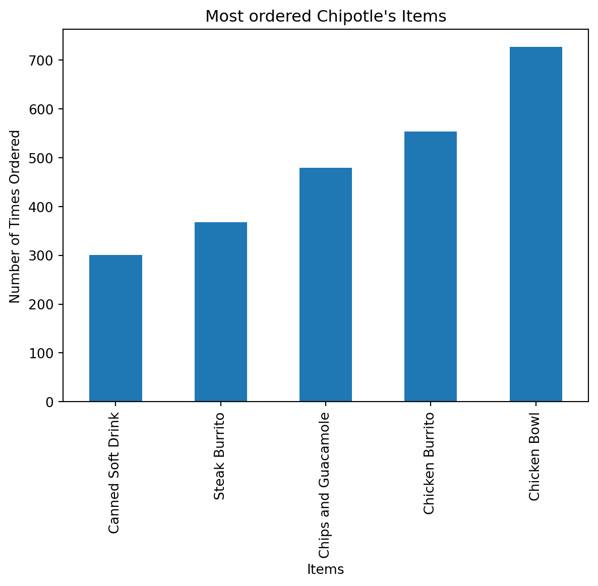
Step 6. Create a scatterplot with the number of items orderered per order price
Hint: Price should be in the X-axis and Items ordered in the Y-axis
# create a list of prices
chipo.item_price = [float(value[1:-1]) for value in chipo.item_price] # strip the dollar sign and trailing space

# then groupby the orders and sum
orders = chipo.groupby('order_id').sum()

# creates the scatterplot
# plt.scatter(orders.quantity, orders.item_price, s = 50, c = 'green')
plt.scatter(x = orders.item_price, y = orders.quantity, s = 50, c = 'green')

# Set the title and labels
plt.xlabel('Order Price')
plt.ylabel('Items ordered')
plt.title('Number of items ordered per order price')
plt.ylim(0)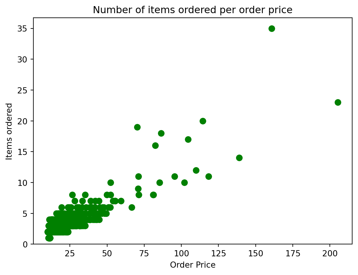
Step 7. BONUS: Create a question and a graph to answer your own question.
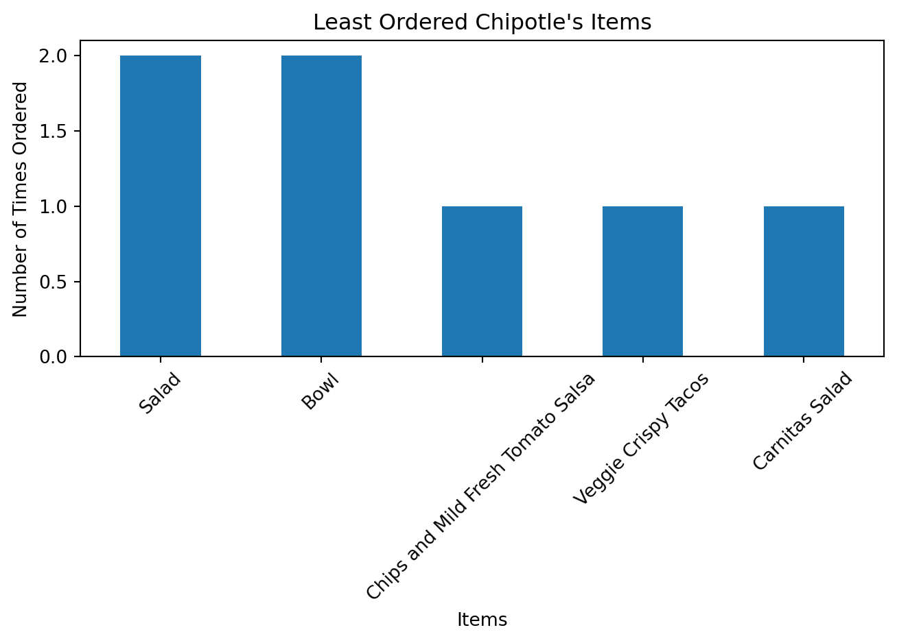
Question:Create a bar chart of the last 5 items purchased
item_counts = chipo['item_name'].value_counts()

df = pd.DataFrame(item_counts).iloc[-5:]

df.reset_index(inplace=True)
df.columns = ['item_name', 'Number of Times Ordered']

df.plot(kind='bar', x='item_name', y='Number of Times Ordered', legend=False)
plt.xlabel('Items')
plt.ylabel('Number of Times Ordered')
plt.title('Least Ordered Chipotle\'s Items')
plt.xticks(rotation=45)
plt.tight_layout()
plt.show()